BlockHeightControl
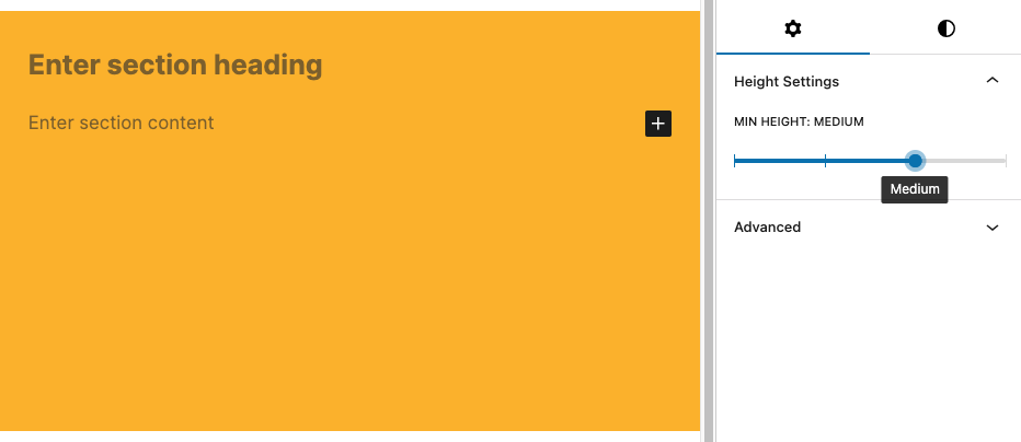
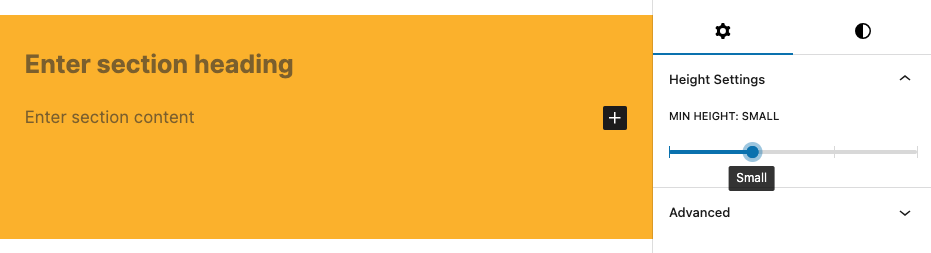
The T2 BlockHeightControl lets you select a height size from a range of sizes. You can use the size value to add a class to your block, and then set the (minimum) height with css.
Example
import { BlockHeightControl } from '@t2/editor';
import { InspectorControls, useBlockProps } from '@wordpress/block-editor';
import { PanelBody } from '@wordpress/components';
import { __ } from '@wordpress/i18n';

export default function Edit({ attributes, setAttributes }) {
    const { minHeight } = attributes;
    const blockProps = useBlockProps({ className: 't2-test-block' });

    return (
        <>
            <InspectorControls>
                <PanelBody title={__('Settings', 't2')}>
                    <BlockHeightControl
                        label={__('Min height', 't2')}
                        value={minHeight}
                        sizes={[
                            { value: 'none', label: __('None', 't2') },
                            { value: 'small', label: __('Small', 't2') },
                            { value: 'medium', label: __('Medium', 't2') },
                            { value: 'large', label: __('Large', 't2') },
                        ]}
                        onChange={(value) => setAttributes({ minHeight: value })}
                    />
                </PanelBody>
            </InspectorControls>
            <div {...blockProps}>
                <p>{__('This is a test block', 't2')}</p>
            </div>
        </>
    );
}
If the sizes array is empty, the control uses the default
sizes: none, small, medium and large.
Component props
export type BlockHeightControlProps = {
    /** The label above the block height control. */
    label?: string;

    /** The selected height name. */
    value: string;

    /** An array of value/label pairs to populate the dropdown control. */
    sizes?: BlockHeightControlSizeOption[];

    /** Callback returning the selected height name when the author selects a height. */
    onChange: (value: string) => void;
};Size option props
export type BlockHeightControlSizeOption = {
    /** The height name */
    value: string;

    /** The height label to be displayed in the dropdown. */
    label: string;
};Screenshots
Small block height
Medium block height