BlockIconSelector
The BlockIconSelector component allows you to insert an icon with an icon picker into a block.
This component is a wrapper around the IconSelector component, which is used in block toolbars.
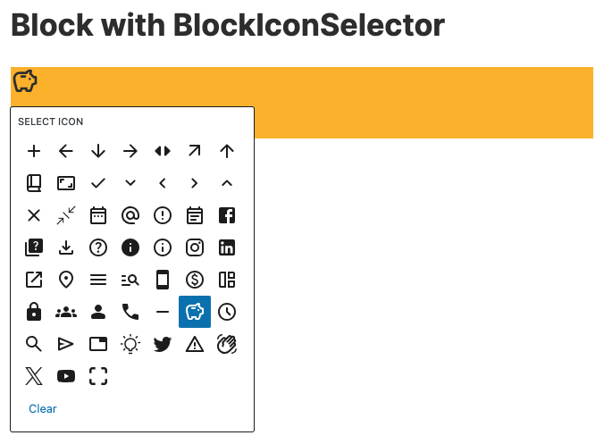
Simple Example
import { BlockIconSelector } from '@t2/editor';
import { useBlockProps } from '@wordpress/block-editor';
import { __ } from "@wordpress/i18n";

export default function Edit({ attributes, setAttributes }) {
    const { icon } = attributes;
    const blockProps = useBlockProps({ className: 't2-test-block' });

    return (
        <div {...blockProps}>
            <BlockIconSelector
                selected={icon}
                label={__('Select icon', 't2')}
                onSelect={(newIcon) => setAttributes({ icon: newIcon })}
            />
        </div>
    );
}Full Example
import { BlockIconSelector, getConfig } from '@t2/editor';
import { useBlockProps } from '@wordpress/block-editor';
import { __ } from '@wordpress/i18n';
import { name } from './block.json';

const ALLOWED_ICONS = getConfig([name, 'features', 'allowedIcons'], undefined);

export default function Edit({ attributes, setAttributes }) {
	const { icon } = attributes;
	const blockProps = useBlockProps({ className: 't2-test-block' });

	return (
		<div {...blockProps}>
			<BlockIconSelector
				selected={icon}
				iconSize={32}
				iconViewbox="0 0 24 24"
				label={__('Select icon', 't2')}
				allowedIcons={ALLOWED_ICONS}
				onSelect={(newIcon) => setAttributes({ icon: newIcon })}
				inline
			/>
		</div>
	);
}Component props
export type BlockIconSelectorProps = {
    /** Array of icon names you want to make available for the user. */
    allowedIcons: string[];

    /** @deprecated Use `selected` instead. */
    icon?: string;

    /** The icon size in px. */
    iconSize?: number;

    /** The icon svg viewbox, i.e. `"0 0 24 24"`. */
    iconViewbox?: string;

    /** Whether to add default inline styling to the toolbar button (true) or not (false). */
    inline?: boolean;

    /** The component label. */
    label?: string;

    /** Callback returning the selected icon name when the author selects an icon. */
    onSelect?: (selected: string | undefined) => string | void;

    /** Icon name to be used for the block toolbar button, defaults to `info`. */
    selected?: string;
};