CheckboxSelector
The CheckboxSelector is a simple control for selecting multiple options
from a list of available options. Each available option is displayed as a checkbox,
allowing users to select one or more options.
This component is useful for scenarios where you want to allow users to make multiple
selections from a predefined set of alternatives. Functionally, it's similar to a
multiple select field, but with a more user-friendly interface.
This component is intended for use in the inspector panel of a block editor.
Basic example
import { CheckboxSelector } from '@t2/editor';
import { InspectorControls, useBlockProps } from '@wordpress/block-editor';
import { PanelBody } from '@wordpress/components';
import { __ } from '@wordpress/i18n';
export default function Edit({ attributes, setAttributes }) {
const { selection } = attributes;
const blockProps = useBlockProps({ className: 't2-test-block' });
return (
<>
<InspectorControls>
<PanelBody title={__('Settings', 't2')}>
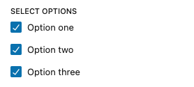
<CheckboxSelector
label={__('Select options', 't2')}
checked={selection || ['one', 'three']}
options={[
{ value: 'one', label: __('Option one', 't2') },
{ value: 'two', label: __('Option two', 't2') },
{ value: 'three', label: __('Option three', 't2') },
]}
onChange={(value) => setAttributes({ selection: value })}
/>
</PanelBody>
</InspectorControls>
<div {...blockProps}>
<p>{__('This is a test block.', 't2')}</p>
</div>
</>
);
}Extended example
import { CheckboxSelector } from '@t2/editor';
import { InspectorControls, useBlockProps } from '@wordpress/block-editor';
import { PanelBody } from '@wordpress/components';
import { __ } from '@wordpress/i18n';
export default function Edit({ attributes, setAttributes }) {
const { selection } = attributes;
const blockProps = useBlockProps({ className: 't2-test-block' });
return (
<>
<InspectorControls>
<PanelBody title={__('Settings', 't2')}>
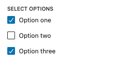
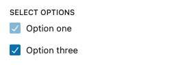
<CheckboxSelector
label={__('Select options', 't2')}
checked={selection || ['one', 'three']}
disabled={['one']}
exclude={['two']}
options={[
{ value: 'one', label: __('Option one', 't2') },
{ value: 'two', label: __('Option two', 't2') },
{ value: 'three', label: __('Option three', 't2') },
]}
onChange={(value) => setAttributes({ selection: value })}
/>
</PanelBody>
</InspectorControls>
<div {...blockProps}>
<p>{__('This is a test block.', 't2')}</p>
</div>
</>
);
}CheckboxSelectorOption properties
export type CheckboxSelectorOption = {
    value: string | number;
    label: string;
};CheckboxSelector properties
export type CheckboxSelectorProps = Omit<BaseControlProps, 'children'> & {
    /** An array of value/label pairs to display as checkboxes. */
    options: CheckboxSelectorOption[];
    /** An array of checkbox values to display as checked in the checkbox list. */
    checked: (string | number)[];
    /** An array of checkbox values to disable in the checkbox list. */
    disabled?: (string | number)[];
    /** An array of checkbox values to exclude from the checkbox list. */
    exclude?: (string | number)[];
    /** An array of checkbox values to include in the checkbox list. */
    include?: (string | number)[];
    /** Callback when a checkbox is checked or unchecked. */
    onChange: (checked: (string | number)[]) => void;
    /** How to sort the values provided by the callback. */
    sortResult?: boolean | 'options-order' | 'include-order' | ((a: string | number, b: string | number) => number);
    /** Properties applied to all the checkboxes. */
    checkboxProps?: WordPressComponentProps<CheckboxControlProps, 'input', false>;
};