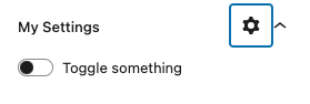
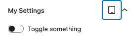
DevicePanelBody (experimental)
The DevicePanelBody is a native PanelBody with a device dropdown.
It supports device-specific settings in a PanelBody by letting
authors selecting a device from the dropdown. The selected device can
then be used to store settings for that specific device.
This component does NOT modify or add any settings by itself. It only provides
a context - the currently selected device - which developers can use for
device-specific settings. Developers can also show/hide settings based on the
selected device.
In order to support device-specific settings, you replace the native
PanelBody component with the custom DevicePanelBody. You typically use
a react state to store the selected device, like:
const [device, setDevice] = useState('default');
Example
import { __experimentalDevicePanelBody as DevicePanelBody } from '@t2/editor';
import { InspectorControls } from '@wordpress/block-editor';
import { ToggleControl } from '@wordpress/components';
import { useState } from '@wordpress/element';
import { __ } from '@wordpress/i18n'

export default function Edit({ attributes, setAttributes }) {
    const { something, desktopSomething, mobileSomething } = attributes;
    const [device, setDevice] = useState('default');

    // Get device-specific attribute value.
    const getSomething = () => {
        switch (device) {
            case 'desktop': return desktopSomething;
            case 'mobile': return mobileSomething;
            default: return something;
        }
    }

    // Set device-specific attribute value.
    const setSomething = (value) => {
        switch (device) {
            case 'desktop': setAttributes({ desktopSomething: value }); break;
            case 'mobile': setAttributes({ mobileSomething: value }); break;
            default: setAttributes({ something: value }); break;
        }
    }

    return (
        <InspectorControls>
            <DevicePanelBody
                title={__('My Settings', 't2')}
                device={device}
                onDeviceChange={(value) => setDevice(value)}
                filter={['default', 'desktop', 'mobile']}
            >
                <ToggleControl
                    label={__('Toggle something', 't2')}
                    checked={getSomething()}
                    onChange={setSomething}
                />
            </DevicePanelBody>
        </InspectorControls>
    );
}Component properties
The DevicePanelBody support the same properties as PanelBody in addition to
the properties below.
export type DevicePanelBodyProps = PanelBodyProps & {
/** The current device: 'default' | 'desktop' | 'tablet' | 'mobile'. */
device?: DeviceType;
/** Array of devices */
options?: DeviceDropdownOption[];
/** Array of allowed options */
filter?: string[];
/** Callback function when the selection is changed. */
onDeviceChange?: (value: DeviceType, option?: DeviceDropdownOption) => void;
/** Dropdown properties. */
dropdownProps?: DropdownProps;
/** If and how to sync the current device with the editor viewport. */
syncEditorViewport?: number;
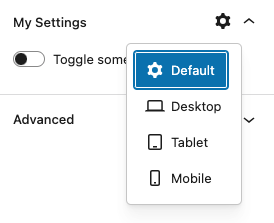
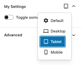
};By default, this component displays four options on the dropdown: default, desktop, tabletand mobile.
You can remove options from the dropdown by using a filter with the options
you want to include, i.e. ['desktop', 'mobile'].
Alternatively, you can replace the default options with your own in case you
need additional devices or custom ones.
[
  { icon: cog, value: 'default', title: __('Default', 't2'), label: __('default', 't2') },
  { icon: desktop, value: 'desktop', title: __('Desktop', 't2'), label: __('desktop', 't2') },
  { icon: tablet, value: 'tablet', title: __('Tablet', 't2'), label: __('tablet', 't2') },
  { icon: mobile, value: 'mobile', title: __('Mobile', 't2'), label: __('mobile', 't2') },
]
The current device for this component can be synced with the device
selected in the block editor - in either direction or both.
const SYNC_OPTIONS = {
	NONE: 0,
	COMPONENT_TO_EDITOR: 1,
	EDITOR_TO_COMPONENT: 2,
	BIDIRECTIONAL: 3,
};