IconSelector
The IconSelector component allows you to pick an icon for use in a block. This component is used in the InspectorControls panel of a block.
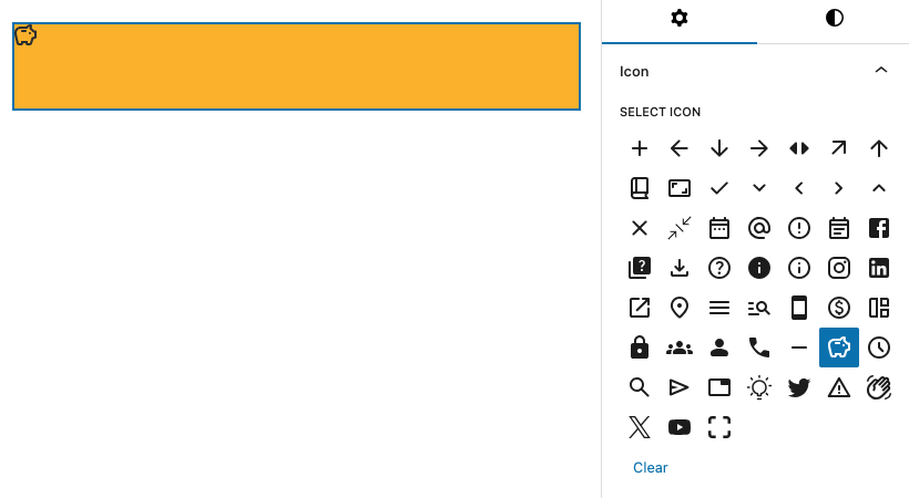
Example
import { Icon, IconSelector } from '@t2/editor';
import { InspectorControls, useBlockProps } from '@wordpress/block-editor';
import { PanelBody } from '@wordpress/components';
import { __ } from '@wordpress/i18n';

export default function Edit({ attributes, setAttributes }) {
	const { icon } = attributes;
	const blockProps = useBlockProps({ className: 't2-test-block' });

	return (
		<>
			<InspectorControls>
				<PanelBody title={__('Icon', 't2')}>
					<IconSelector
						selected={icon}
						label={__('Select Icon', 't2')}
						onSelect={(value) => setAttributes({ icon: value })}
					/>
				</PanelBody>
			</InspectorControls>
			<div {...blockProps}>
				<Icon icon={icon} />
			</div>
		</>
	);
}Component Props
export type IconSelectorProps = {
	/** Array of icon names you want to make available for the user. */
	allowedIcons?: string[];

	/** The icon size in px. */
	iconSize?: number;

	/** The icon svg viewbox, i.e. `"0 0 24 24"`. */
	iconViewbox?: string;

	/** The component label. */
	label?: string;

	/** Additional help text for the component. */
	help?: string;

	/** Callback returning the selected icon name when the author selects an icon. */
	onSelect?: (selected: string | undefined) => string | void;

	/** Icon name to be used for the block toolbar button, defaults to `info`. */
	selected?: string;
};