InspectorDropdown
The T2 InspectorDropdown is a base component for displaying dropdowns in the
inspector panel. It's not a stand-alone component, but intended to be used by
other controls. It's similar to the native ToolbarDropdownMenu component,
with the main difference that it's displayed in InspectorControls and
not in BlockControls.
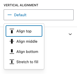
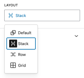
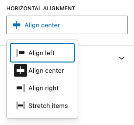
It's used by LayoutDropdown, HorizontalAlignDropdown and VerticalAlignDropdown.
allowing them to be used both in the Block Toolbar and in the Inspector Panel.
Each dropdown menu item is represented by a DropdownMenuOption object, containing
a value, an icon and a title.
Example
import { __ } from '@wordpress/i18n';
import { group, row, stack, grid } from '@wordpress/icons';
import { InspectorDropdown } from '@t2/editor';

const options = [
	{ value: 'default', icon: group, title: __('Default', 't2') },
	{ value: 'stack', icon: stack, title: __('Stack', 't2') },
	{ value: 'row', icon: row, title: __('Row', 't2') },
	{ value: 'grid', icon: grid, title: __('Grid', 't2') },
];

export function MyDropdown(props) {
	const {label, value, onChange, required } = props;

	return (
		<InspectorDropdown
			label={__('Layout', 't2')}
			value={value || 'default'}
			options={options}
			onChange={(selection: string | undefined) => onChange(selection)}
			required={true}
		/>
	);
}Component properties
export type InspectorDropdownProps = {
	/** The control label. */
	label?: string;

	/** The selected dropdown menu item. */
	value?: string;

	/** Callback returning the selected dropdown value. */
	onChange: (value: string | undefined) => void;

	/** An array of dropdown menu items. */
	options: InspectorDropdownOption[];

	/** Whether a valid string value is always returned (true) or not (false, default). */
	required?: boolean;
};Components based on InspectorDropdown
LayoutDropdown
HorizontalAlignDropdown
VerticalAlignDropdown