MediaAndFocalPicker
The MediaAndFocalPicker is a combined media picker for images/videos and
their focal points. In contrast to the existing T2 MediaReplacer and the
WordPress core MediaReplaceFlow components, it's intended for use in the
InspectorControls panel.
It looks similar to the native post FeaturedImage picker, but is for use with
blocks, not with posts.
Implementation
The MediaAndFocalPicker is a wrapper built around the core MediaReplaceFlow and
FocalPointPicker components. The property names are based on MediaReplaceFlow
but with some adjustments in order to prevent naming conflicts and to regard Dekode
naming conventions.
The core FocalPointPicker is used to display the selected media
and to modify the focal point. Since selecting media and their focal
point are frequently used together, it makes sense to provide both features
in one place, not separated in BlockControls and InspectorControls.
WordPress component documentation:
Usage
You can use the MediaAndFocalPicker as an easy-to-use alternative to a
combination of the T2 MediaReplacer (or the core MediaReplaceFlow)
and the FocalPointPicker components in your blocks. It will save you some
work and give authors a better user experience.
Basic example
import { MediaAndFocalPicker, MediaSuiteViewer } from '@t2/editor';
import { InspectorControls, useBlockProps } from '@wordpress/block-editor';
import { PanelBody } from '@wordpress/components';

export default function Edit({ attributes, setAttributes }) {
    const { mediaId, mediaUrl, mediaType, focalPoint } = attributes;
    const blockProps = useBlockProps({ className: 't2-test-block' });

    return (
        <>
            <InspectorControls>
                <PanelBody title="Media settings">
                    <MediaAndFocalPicker
                        mediaId={mediaId}
                        mediaUrl={mediaUrl}
                        mediaType={mediaType}
                        focalPoint={focalPoint}
                        onFocalChange={(value) => setAttributes({ focalPoint: value })}
                        onSelectMedia={(media) => {
                            setAttributes({ mediaId: media.id, mediaUrl: media.url, mediaType: media.type });
                        }}
                        onRemoveMedia={() => {
                            setAttributes({ mediaId: undefined, mediaUrl: undefined, mediaType: undefined });
                        }}
                    />
                </PanelBody>
            </InspectorControls>
            <div {...blockProps}>
                <MediaSuiteViewer mediaUrl={mediaUrl} focalPoint={focalPoint} aspectRatio="16/9" objectFit="cover" />
            </div>
        </>
    );
}Screenshots of the above example
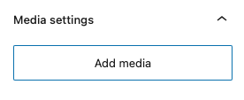
Without selected media
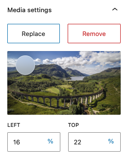
With selected media
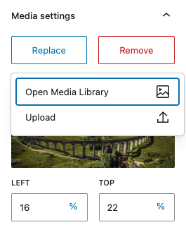
With selected media and open dropdown
Callbacks and editor UI
The visual appearance of the MediaAndFocalPicker in the editor UI depends
primarily on the callbacks you set in the component. As an example, the
Remove button is only displayed when the onRemoveMedia callback is set.
Optional callbacks changing the visual appearance in the editor UI:
onFocalChange: Displays the FocalPointPicker and is called when the focal point changes.onToggleFeatured: Displays a menu item for using the post featured media.onSelectURLonSelectUrlinstead.onSelectUrl: Displays a menu item for setting/changing a media url.onEmbedUrl: Displays a menu item for setting/changing an embedded media url.onResetMedia: Displays a Reset menu item when a media is selected.onRemoveMedia: Displays a Remove button when a media is selected.
Required callbacks (no visual change):
onSelectMedia: Called when the selected image changes.
Enhanced example
import { MediaAndFocalPicker, MediaSuiteViewer, useFeaturedMedia } from '@t2/editor';
import { InspectorControls, useBlockProps } from '@wordpress/block-editor';
import { PanelBody } from '@wordpress/components';

export default function Edit({ attributes, setAttributes }) {
    const { mediaId, mediaUrl, mediaType, focalPoint, useFeatured } = attributes;
    const blockProps = useBlockProps({ className: 't2-test-block' });

    /* Reusable function to update media attributes */
    const updateMedia = (media) => {
        setAttributes({ mediaId: media.id, mediaUrl: media.url, mediaType: media.type });
    };

    /* This hook is required for post featured media support */
    useFeaturedMedia(useFeatured, mediaId, updateMedia);

    return (
        <>
            <InspectorControls>
                <PanelBody title="Media settings">
                    <MediaAndFocalPicker
                        mediaId={mediaId}
                        mediaUrl={mediaUrl}
                        mediaType={mediaType}
                        focalPoint={focalPoint}
                        useFeatured={useFeatured}
                        onFocalChange={(value) => setAttributes({ focalPoint: value })}
                        onToggleFeatured={(value) => setAttributes({ useFeatured: value })}
                        onSelectMedia={updateMedia}
                        onSelectUrl={updateMedia}
                        onEmbedUrl={updateMedia}
                        onRemoveMedia={updateMedia}
                        onResetMedia={updateMedia}
                    />
                </PanelBody>
            </InspectorControls>
            <div {...blockProps}>
                <MediaSuiteViewer
                    mediaId={mediaId}
                    mediaUrl={mediaUrl}
                    mediaType={mediaType}
                    focalPoint={focalPoint}
                    aspectRatio="16/9"
                    objectFit="cover"
                />
            </div>
        </>
    );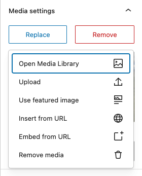
}Screenshot of the above example with open dropdown
The basic media object
Depending on the media action, WordPress provides two different media objects
with different property names for media url, type, mime and alt. In order
to prevent this ambiguity, the first parameter of the below callbacks all provide a
normalized basic media object.
export type BasicMediaProps = {
    id: number | undefined; /* The media attachment id */
    url: string | undefined; /* The media url */
    type: string | undefined; /* The media type: `image`, `video`, etc. */
    mime: string | undefined; /* The media mime type: `image/jpeg`, `video/mp4`, etc. */
    alt: string | undefined; /* The media alt text */
};

export type MediaAndFocalPickerProps = {
    onSelectMedia: (basic: BasicMediaProps, media: unknown) => void;
    onSelectUrl: (basic: BasicMediaProps) => void;
    onEmbedUrl: (basic: BasicMediaProps) => void;
    onRemoveMedia: (basic: BasicMediaProps) => void;
    onResetMedia: (basic: BasicMediaProps) => void;
};
onSelectMedia also contains the media object natively provided by WordPress
as a second parameter.
It may seem strange to provide a basic media object when a media is removed,
but it allows you to use one single callback for updating your media properties
in your block.
const updateMedia = (media) => {
    setAttributes({ mediaId: media.id, mediaUrl: media.url, mediaType: media.type });
};
When a media is removed, all properties are undefined. With onSelectUrl and onEmbedUrl,
only the url, type and mime properties may have a value, the others are undefined.
The useFeaturedMedia hook
Components in the InspectorControl are not updated when they are hidden,
which is always the case when an author changes the post featured media.
In order to update the media properties without delay when the post featured
media changes, you must add the useFeaturedMedia hook in your block.
This is only required when the onToggleFeatured callback is set in the
MediaAndFocalPicker. You can see how to use this hook in the
Enhanced example above.
Component properties
The property names are based on the MediaReplaceFlow component, but with
some adjustments in order to prevent naming conflicts and to regard Dekode
naming conventions.
export type MediaAndFocalPickerProps = {

    /** The media (attachment) id. Required for performance, but can be undefined if mediaUrl is set. */
    mediaId: number | undefined;

    /** The media url. Required for performance, but can be undefined if mediaId is set. */
    mediaUrl: string | undefined;

    /** The media type: image, video, etc. Required but can be undefined */
    mediaType: string | undefined;

    /** An array of media ids for use with media galleries */
    mediaIds?: number[];

    /** Comma delimited list of MIME types accepted for upload, i.e `image/jpeg, video/mp4`. */
    accept?: string;

    /** An array of media types allowed to replace the current media, i.e. `image`, `video`. */
    allowedTypes?: string[];

    /** The Add button content (usually text). */
    addMediaText?: ReactNode;

    /** The Replace button content (usually text). */
    replaceMediaText?: ReactNode;

    /** The Remove button content (usually text). */
    removeMediaText?: ReactNode;

    /** The Reset media item content (usually text). */
    resetMediaText?: ReactNode;

    /** The media focal point. */
    focalPoint?: FocalPoint;

    /** Whether to use the post featured media (true) or not (false). */
    useFeatured?: boolean;

    /** Callback triggered when the focal point changes (required). */
    onFocalChange?: (focalPoint: FocalPoint | undefined) => void;

    /** Callback triggered when useFeatured changes. Displays the Use Featured Media menu item in the dropdown, */
    onToggleFeatured?: (useFeatured: boolean) => void;

    /** Callback triggered when media is replaced (required). */
    onSelectMedia: (basic: BasicMediaProps, media: unknown) => void;

    /** Callback triggered when media is replaced with a URL. Displays a corresponding menu item in the dropdown  */
    onSelectUrl?: (basic: BasicMediaProps) => void;

    /** Callback triggered when media is embedded. Displays a corresponding menu item in the dropdown  */
    onEmbedUrl?: (basic: BasicMediaProps) => void;

    /** Callback triggered when files are uploaded and enables this feature. */
    onFilesUpload?: (files: FileList | null) => void;

    /** Callback triggered when media is removed. Displays the remove button when set. */
    onRemoveMedia?: (basic: BasicMediaProps) => void;

    /** Callback triggered when media is removed. Displays the Reset menu item in the dropdown. */
    onResetMedia?: (basic: BasicMediaProps) => void;

    /** Callback triggered when an upload error occurs (currently not supported). */
    onError?: (message: string) => void;

    /** Whether to allow multiple media selections (true) or not (false). */
    multiple?: boolean | 'add';

    /** Whether to add media to a gallery (true) or not (false). */
    addToGallery?: boolean;

    /** Whether to handle uploads (true) or not (false). */
    handleUpload?: boolean;

    /** Popover (Dropdown) properties, only partially supported. */
    popoverProps?: DropdownProps['popoverProps'];

    /** Allows customizing of the toggle (add or replace) button, i.e. to add an icon. */
    renderToggle?: (toggleButtonProps: ButtonProps) => ReactNode;

    /** Allows customizing of the toggle button. */
    toggleButtonProps?: ButtonProps;

    /** Allows customizing of the remove button, i.e. to add an icon. */
    removeButtonProps?: ButtonProps;

    /** Allows customizing of the FocalPointPicker. */
    focalPointProps?: FocalPointPickerProps;

    /** The MediaAndFocalPickerProps root element class name. */
    className?: string;

    /** Adds additional menu items to the dropdown. */
    children?: ReactNode;
};