SizeRangeControl
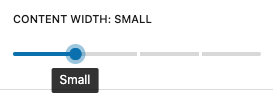
The T2 Size Range Control is a generic control for selecting any type of
preset sizes, i.e. block width, block height, column gap, spacing, etc.
The sizes follow a t-shirt pattern with extra intermediate steps.
Example
import { SizeRangeControl } from '@t2/editor';
import { InspectorControls, useBlockProps } from '@wordpress/block-editor';
import { PanelBody } from '@wordpress/components';
import { __ } from '@wordpress/i18n';

export default function Edit({ attributes, setAttributes }) {
    const { maxContentWidth } = attributes;
    const blockProps = useBlockProps({ className: 't2-test-block' });

    return (
        <>
            <InspectorControls>
                <PanelBody title={__('Settings', 't2')}>
                    <SizeRangeControl
                        label={__('Content width', 't2')}
                        value={maxContentWidth}
                        filter={['', 'sm', 'md', 'lg', 'full']}
                        onChange={(value) => setAttributes({ maxContentWidth: value })}
                        allowReset={false}
                    />{' '}
                </PanelBody>
            </InspectorControls>
            <div {...blockProps}>
                <p>{__('This is a test block', 't2')}</p>
            </div>
        </>
    );
}Component properties
export type SizeRangeProps = {
	/** The control label. */
	label?: string;

	/** The selected size, one of the built-in or custom sizes. */
	value?: string;

	/** Filters the control to only displays a subset of the available sizes. */
	filter?: boolean | string[];

	/** Callback providing the selected size when the selection is changed. */
	onChange: (value: string | undefined) => void;

	/** Whether to display a reset button (true) or not (false). */
	allowReset?: boolean;
};Built-in sizes
[
	{ value: '', label: __('Default', 't2') },
	{ value: 'none', label: __('None', 't2') },
	{ value: 'xxs', label: __('2x Small', 't2') },
	{ value: 'xs', label: __('Extra Small', 't2') },
	{ value: 'sm', label: __('Small', 't2') },
	{ value: 'ms', label: __('Medium small', 't2') },
	{ value: 'md', label: __('Medium', 't2') },
	{ value: 'ml', label: __('Medium large', 't2') },
	{ value: 'lg', label: __('Large', 't2') },
	{ value: 'xl', label: __('Extra Large', 't2') },
	{ value: 'xxl', label: __('2x Large', 't2') },
	{ value: 'hg', label: __('Huge', 't2') },
	{ value: 'xh', label: __('Extra Huge', 't2') },
	{ value: 'xxh', label: __('2x Huge', 't2') },
	{ value: 'full', label: __('Full', 't2') },
]
You can filter (reduce) the sizes to display in the control or add our
own with the t2.SizeRangeControl.allOptions hook.