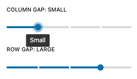
SpacingRangeControl
The Spacing range control reads the spacing sizes from theme.json and displays
them in a RangeControl. The control can be used to set block spacing like
gaps, padding, margins. etc. The values are the spacing size slugs configured
in theme.json.
The spacing sizes can be filtered to only display a subset of the
available sizes.
Example
import { SpacingRangeControl } from '@t2/editor';
import { InspectorControls, useBlockProps } from '@wordpress/block-editor';
import { PanelBody } from '@wordpress/components';
import { __ } from '@wordpress/i18n';

export default function Edit({ attributes, setAttributes }) {
    const { columnGap, rowGap } = attributes;
    const blockProps = useBlockProps({ className: 't2-test-block' });

    return (
        <>
            <InspectorControls>
                <PanelBody title={__('Settings', 't2')}>
                    <SpacingRangeControl
                        label={__('Column gap', 't2')}
                        value={columnGap}
                        onChange={(value) => setAttributes({ columnGap: value })}
                    />
                    <SpacingRangeControl
                        label={__('Row gap', 't2')}
                        value={rowGap}
                        onChange={(value) => setAttributes({ rowGap: value })}
                    />
                </PanelBody>
            </InspectorControls>
            <div {...blockProps}>
                <p>{__('This is a test block', 't2')}</p>
            </div>
        </>
    );
}Component properties
export type SpacingRangeProps = {
	/** The RangeControl label. */
	label?: string;

	/**The spacing size slug. */
	value?: string;

	/** Filters the available sizes. */
	filter?: string[];

	/** Callback providing the selected spacing size slug when the selection changes. */
	onChange?: (value: string | undefined) => void;

	/** Whether to display a 'none' option in the range (true) or not (false, default). */
	showNoneOption?: boolean;

	/** Whether to display a 'default' option in the range (true) or not (false, default). */
	showDefaultOption?: boolean;

	/** Whether to display a reset button (true) or not (false, default). */
	allowReset?: boolean;
};