VerticalAlignDropdown
The T2 Vertical Align Dropdown displays options for vertical alignments
in a dropdown: top, center, bottom, stretch and space-between.
It can be displayed both in BlockControls and InspectorControls.
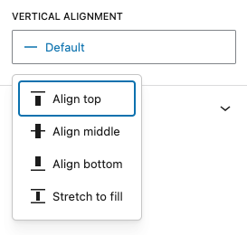
Inspector panel example
import { VerticalAlignDropdown } from '@t2/editor';
import { InspectorControls, useBlockProps } from '@wordpress/block-editor';
import { PanelBody } from '@wordpress/components';
import { __ } from '@wordpress/i18n';

export default function Edit({ attributes, setAttributes }) {
    const { alignItems } = attributes;
    const blockProps = useBlockProps({ className: 't2-test-block' });

    return (
        <>
            <InspectorControls>
                <PanelBody title={__('Settings', 't2')}>
                    <VerticalAlignDropdown
                        type="inspector"
                        value={alignItems}
                        filter={['top', 'center', 'bottom', 'stretch']}
                        onChange={(value) => setAttributes({ alignItems: value })}
                        required={false}
                    />
                </PanelBody>
            </InspectorControls>
            <div {...blockProps}>
                <p>{__('This is a test block.', 't2')}</p>
            </div>
        </>
    );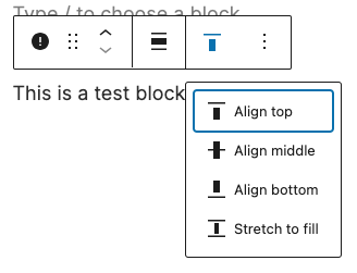
}Toolbar example
import { VerticalAlignDropdown } from '@t2/editor';
import { BlockControls, useBlockProps } from '@wordpress/block-editor';
import { __ } from '@wordpress/i18n';

export default function Edit({ attributes, setAttributes }) {
    const { alignItems } = attributes;
    const blockProps = useBlockProps({ className: 't2-test-block' });

    return (
        <>
            <BlockControls>
                <VerticalAlignDropdown
                    type="toolbar"
                    value={alignItems}
                    filter={['top', 'center', 'bottom', 'stretch']}
                    onChange={(value) => setAttributes({ alignItems: value })}
                    required={false}
                />
            </BlockControls>
            <div {...blockProps}>
                <p>{__('This is a test block.', 't2')}</p>
            </div>
        </>
    );
}Default dropdown options
[
	{ value: 'top', icon: alignTop, title: __('Align top', 't2') },
	{ value: 'center', icon: alignCenter, title: __('Align middle', 't2') },
	{ value: 'bottom', icon: alignBottom, title: __('Align bottom', 't2') },
	{ value: 'stretch', icon: alignStretch, title: __('Stretch to fill', 't2') },
	{ value: 'space-between', icon: spaceBetween, title: __('Space between', 't2') },
]
You can filter (reduce) the menu items to display in the control or add our
own with the t2.VerticalAlignDropdown.allOptions hook.
Component properties
export type AlignDropdownProps = {
    /** Control type: `toolbar` (default) or `inspector` */
    type?: string;

    /** Control label */
    label?: string;

    /** The selected vertical alignment value: `top`, `center`, `bottom`, `stretch` or `space-between`. */
    value?: string;

    /** Filters the control to only displays a subset of the available options. */
    filter?: boolean | string[];

    /** Callback function when the selection is changed. */
    onChange: (value: string | undefined) => void;

    /** Whether an alignment value is required (true) or not (false). */
    required?: boolean;
};See also
- HorizontalAlignDropdown - A dropdown displaying options for horizontal alignments.