MediaSuitePanel
A shared inspector panel for media controls.
The MediaSuitePanel lets you display media controls from multiple sources — blocks, components, supports, and filters — in a single media panel.
You can control the order of panel entries by assigning a priority value to each. Following WordPress conventions, lower numbers appear first, with 10 as the default.
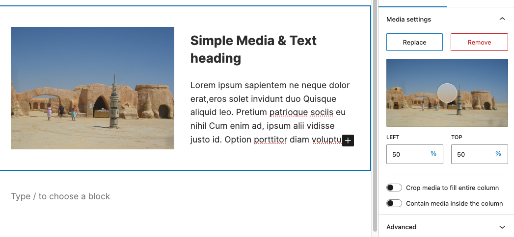
In the screenshot of the Simple Media & Text block above, the MediaAndFocalPicker is provided by the MediaSuite component, while the toggle controls come from the block itself. All controls are displayed in one panel, rather than being separated by source.
Additional media controls can come from other sources, such as supports or filters. MediaSuitePanel ensures that all controls appear together in a single shared panel, ordered by priority.
Slot and Fill components
The MediaSuitePanel is composed of two components that work together using the Slot and Fill pattern:
MediaSuitePanel.Slot: Defines the slot (position) where the media panel will appear.MediaSuitePanel.Fill: Fills the panel with media controls.
Usage with MediaSuite
The MediaSuite component uses MediaSuitePanel.Slot and MediaSuitePanel.Fill internally to display media controls in the inspector panel. MediaSuitePanel was designed so that blocks, components, supports, or filters can add their own media controls to the same panel.
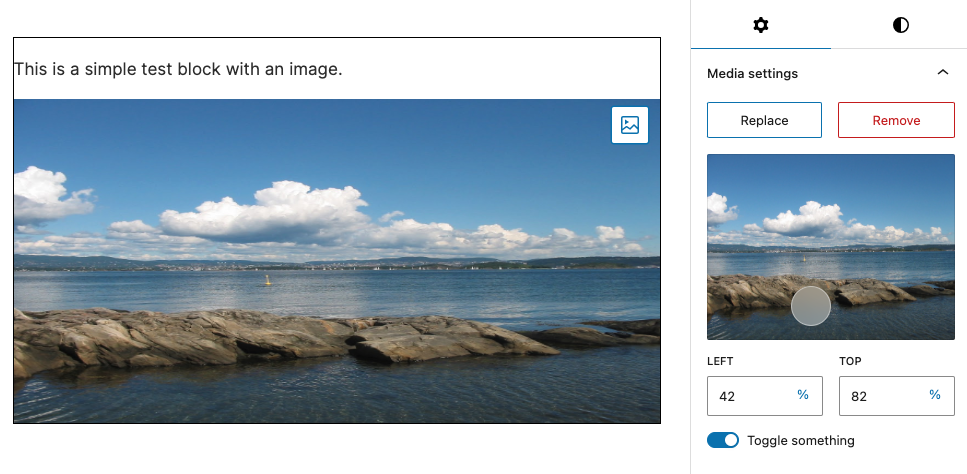
Since the MediaSuite already includes the Slot, you only need to add your media controls with the Fill component. In this example, a toggle control (priority 10 by default) is added to the media panel after the controls from the MediaSuite component (priority 5).
import { MediaSuite, MediaSuitePanel } from '@t2/editor';
import { useBlockProps } from '@wordpress/block-editor';
import { ToggleControl } from '@wordpress/components';
import { __ } from '@wordpress/i18n';

export default function Edit({ attributes, setAttributes }) {
	const { mediaId, mediaUrl, mediaType, focalPoint, something } = attributes;
	const blockProps = useBlockProps({ className: 't2-test-block' });

	const updateMedia = (media) => {
		setAttributes({ mediaId: media.id, mediaUrl: media.url, mediaType: media.type });
	};

	return (
		<>
			<MediaSuitePanel.Fill>
				<ToggleControl
					label={__('Toggle something', 't2')}
					checked={something}
					onChange={(value) => setAttributes({ something: value })}
				/>
			</MediaSuitePanel.Fill>
			<div {...blockProps}>
				<p>{__('This is a simple test block with an image.', 't2')}</p>
				<MediaSuite
					mediaId={mediaId}
					mediaUrl={mediaUrl}
					mediaType={mediaType}
					aspectRatio={2}
					focalPoint={focalPoint}
					onFocalChange={(value) => setAttributes({ focalPoint: value })}
					onSelectMedia={updateMedia}
					onSelectUrl={updateMedia}
					onRemoveMedia={updateMedia}
					onResetMedia={updateMedia}
				/>
			</div>
		</>
	);
}Standalone usage (without MediaSuite)
The purpose of MediaSuitePanel is to merge media controls from multiple sources into a single panel. If you know that all media controls will come only from your block, you can simply use the PanelBody component instead of MediaSuitePanel.
Using MediaSuitePanel.Slot
If you are using the MediaSuite component, the Slot is already included. Otherwise, you must add it to the InspectorControls yourself. Do not wrap it in a PanelBody, as it provides its own panel.
The default panel title is "Media settings", but you can change it by passing a title to the MediaSuitePanel.Slot component.
import { MediaSuitePanel } from '@t2/editor';
import { useBlockProps } from '@wordpress/block-editor';
import { InspectorControls } from '@wordpress/block-editor';
import { __ } from '@wordpress/i18n';
import { ToggleControl } from "@wordpress/components";

export default function Edit({ attributes, setAttributes }) {
    const { toggleSettingOne, toggleSettingTwo, toggleSettingThree } = attributes;
    const blockProps = useBlockProps({ className: 't2-test-block' });

    return (
        <>
            <InspectorControls>
                <MediaSuitePanel.Slot title={__('My media settings', 't2')}/>
            </InspectorControls>
            <div {...blockProps}>
                <p>{__('This is a simple test block with an image.', 't2')}</p>
            </div>
        </>
    );
}Using MediaSuitePanel.Fill
The Fill component is used to add media controls to the panel. It can be used in blocks, components, supports, or filters. Wrap your media controls in a MediaSuitePanel.Fill component and set the priority prop if you want to control their order.
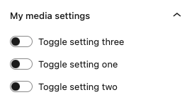
In this example, three toggle controls are added to the media panel. The last Fill has a priority of 5, so the third toggle appears at the top of the panel.
import { MediaSuitePanel } from '@t2/editor';
import { useBlockProps } from '@wordpress/block-editor';
import { InspectorControls } from '@wordpress/block-editor';
import { ToggleControl } from '@wordpress/components';
import { __ } from '@wordpress/i18n';

export default function Edit({ attributes, setAttributes }) {
    const { toggleSettingOne, toggleSettingTwo, toggleSettingThree } = attributes;
    const blockProps = useBlockProps({ className: 't2-test-block' });

    return (
        <>
            <InspectorControls>
                <MediaSuitePanel.Slot title={__('My media settings', 't2')} />
            </InspectorControls>
            <MediaSuitePanel.Fill>
                <ToggleControl
                    label={__('Toggle setting one', 't2')}
                    checked={toggleSettingOne}
                    onChange={(value) => setAttributes({ toggleSettingOne: value })}
                />
                <ToggleControl
                    label={__('Toggle setting two', 't2')}
                    checked={toggleSettingTwo}
                    onChange={(value) => setAttributes({ toggleSettingTwo: value })}
                />
            </MediaSuitePanel.Fill>
            {/* The content of this Fill will appear at the top of the panel. */}
            <MediaSuitePanel.Fill priority={5}>
                <ToggleControl
                    label={__('Toggle setting three', 't2')}
                    checked={toggleSettingThree}
                    onChange={(value) => setAttributes({ toggleSettingThree: value })}
                />
            </MediaSuitePanel.Fill>
            <div {...blockProps}>
                <p>{__('This is a simple test block with an image.', 't2')}</p>
            </div>
        </>
    );
}MediaSuitePanel properties
export type MediaSuitePanelSlotProps = {
    /** Custom panel title (defaults to 'Media settings'). */
    title?: string;

    /** Props passed to all fills. */
    fillProps?: Record<string, unknown>;
};

export type MediaSuitePanelFillProps = {
    /** Determines order; lower values appear first (default: 10). */
    priority?: number;

    /** The media controls to render inside the panel. */
    children: ReactNode;
};