MediaSuitePicker
Media picker with built-in support for featured media, media urls and embedded (streaming) media.
See the MediaAndFocalPicker documentation for how to use this component (except the focal point picker). The MediaSuitePicker is actually used internally in MediaAndFocalPicker.
Media picker location
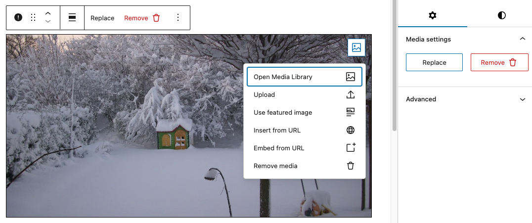
The MediaSuitePicker can be used in three different locations, which slightly changes its appearance and behavior. Providing the picker location with toolbar, sidebar or block is mandatory.
- Toolbar: The media picker is displayed in the block editor toolbar (
BlockControls). Due to WordPress requirements, there is no wrapper element with a class name around the button(s) in this location. - Sidebar: The media picker is displayed in the block editor sidebar (
InspectorControls). For this location, consider using the MediaAndFocalPicker instead, which supports a focal point picker as well. - Block: The media picker is displayed in the block editor content area (iframe). In order to overcome WordPress limitations, a custom version of
MediaReplaceFlowis used in this location.
Full example
In this example, all three locations are used at once (see screenshot above). Note that the callbacks for updating media all have the same signature, allowing us to use one single update function for all of them.
import { MediaSuitePicker, MediaSuiteViewer } from '@t2/editor';
import { BlockControls, InspectorControls, useBlockProps } from '@wordpress/block-editor';
import { PanelBody } from '@wordpress/components';

export default function Edit({ attributes, setAttributes }) {
    const { mediaId, mediaUrl, mediaType, useFeatured } = attributes;
    const blockProps = useBlockProps({ className: 't2-test-block' });

    // Unified callback signature for updating media.
    const updateMedia = (media) => {
        setAttributes({ mediaId: media.id, mediaUrl: media.url, mediaType: media.type });
    };

    return (
        <>
            {/* Toolbar picker */}
            <BlockControls>
                <MediaSuitePicker
                    location="toolbar"
                    mediaId={mediaId}
                    mediaUrl={mediaUrl}
                    useFeatured={useFeatured}
                    onToggleFeatured={(value) => setAttributes({ useFeatured: value })}
                    onSelectMedia={updateMedia}
                    onSelectUrl={updateMedia}
                    onEmbedUrl={updateMedia}
                    onResetMedia={updateMedia}
                    onRemoveMedia={updateMedia}
                />
            </BlockControls>
            {/* Sidebar picker */}
            <InspectorControls>
                <PanelBody title="Media settings">
                    <MediaSuitePicker
                        location="sidebar"
                        mediaId={mediaId}
                        mediaUrl={mediaUrl}
                        useFeatured={useFeatured}
                        onToggleFeatured={(value) => setAttributes({ useFeatured: value })}
                        onSelectMedia={updateMedia}
                        onSelectUrl={updateMedia}
                        onEmbedUrl={updateMedia}
                        onResetMedia={updateMedia}
                        onRemoveMedia={updateMedia}
                    />
                </PanelBody>
            </InspectorControls>
            <div {...blockProps}>
                <MediaSuiteViewer
                    mediaId={mediaId}
                    mediaUrl={mediaUrl}
                    mediaType={mediaType}
                    aspectRatio="2"
                    objectFit="cover"
                    renderMediaPicker={(viewerProps) => (
                        /* Block picker */
                        <MediaSuitePicker
                            location="block"
                            placement="top-end"
                            mediaId={viewerProps.mediaId}
                            mediaUrl={viewerProps.mediaUrl}
                            useFeatured={useFeatured}
                            onToggleFeatured={(value) => setAttributes({ useFeatured: value })}
                            onSelectMedia={updateMedia}
                            onSelectUrl={updateMedia}
                            onEmbedUrl={updateMedia}
                            onResetMedia={updateMedia}
                            replaceMediaText=""
                        />
                    )}
                />
            </div>
        </>
    );
}Event handlers and editor UI
The visual appearance of the MediaSuitePicker in the editor UI depends on the event handlers you provide. As an example, the Remove button is only displayed when the onRemoveMedia event handler is provided.
Optional callbacks changing the visual appearance in the editor UI:
onToggleFeatured: Displays a menu item for using the post featured media.onSelectUrl: Displays a menu item for setting/changing a media url.onEmbedUrl: Displays a menu item for setting/changing an embedded media url.onResetMedia: Displays a Reset menu item when a media is selected.onRemoveMedia: Displays a Remove button when a media is selected.
Required callbacks (no visual change):
onSelectMedia: Called when the selected image changes.
Reference
MediaSuitePicker component props
export type MediaSuitePickerProps = {
	/** Media (attachment) ID. Optional if mediaUrl is provided. */
	mediaId: number | undefined;

	/** Media URL. Optional if mediaId is provided. */
	mediaUrl: string | undefined;

	/** An array of media ids for use with media galleries */
	mediaIds?: MediaReplaceFlowProps['mediaIds'];

	/** Comma-delimited list of MIME types accepted for upload, i.e `image/jpeg, video/mp4`. */
	accept?: MediaReplaceFlowProps['accept'];

	/** An array of media types allowed to replace the current media, i.e. `image`, `video`. */
	allowedTypes?: MediaReplaceFlowProps['allowedTypes'];

    /** The media picker location. */
    location: 'toolbar' | 'sidebar' | 'block';

    /** Where to place the media picker within a container. */
	placement?:
		| 'top'
		| 'top-start'
		| 'top-end'
		| 'bottom'
		| 'bottom-start'
		| 'bottom-end'
		| 'left'
		| 'left-start'
		| 'left-end'
		| 'right'
		| 'right-start'
		| 'right-end';

	/**
	 * The content to display inside the Add button.
	 * Typically a text, but any supported `Button` child elements are allowed.
	 */
	addMediaText?: ReactNode;

	/**
	 * The content to display inside the Replace button.
	 * Typically a text, but any supported `Button` child elements are allowed.
	 */
	replaceMediaText?: ReactNode;

	/**
	 * The content to display inside the Remove button.
	 * Typically a text, but any supported `Button` child elements are allowed.
	 */
	removeMediaText?: ReactNode;

	/**
	 * The content to display inside the Reset menu item.
	 * Typically a text, but any supported `MenuItem` child elements are allowed.
	 */
	resetMediaText?: ReactNode;

	/** Whether to use the post featured media (true) or not (false). */
	useFeatured?: MediaReplaceFlowProps['useFeaturedImage'];

	/**
	 * Callback used when useFeatured changes.
	 * Displays the Use Featured Media menu item in the dropdown,
	 */
	onToggleFeatured?: (useFeatured: boolean) => void;

	/** Callback used when media is replaced (required). */
	onSelectMedia: UpdateMediaHandler;

	/** Callback used when media is replaced with a URL. Displays a corresponding menu item in the dropdown  */
	onSelectUrl?: BasicMediaHandler;

	/** Callback used when media is embedded. Displays a corresponding menu item in the dropdown  */
	onEmbedUrl?: BasicMediaHandler;

	/**
	 * Callback used when files are uploaded and enables this feature.
	 */
	onFilesUpload?: MediaReplaceFlowProps['onFilesUpload'];

	/** Callback used when media is removed. Displays the remove button when set. */
	onRemoveMedia?: BasicMediaHandler;

	/**
	 * Callback used when media is removed.
	 * Displays the Reset menu item in the dropdown.
	 */
	onResetMedia?: BasicMediaHandler;

	/** Callback used when an upload error occurs (currently not supported). */
	onError?: MediaReplaceFlowProps['onError'];

	/** Whether to allow multiple media selections (true) or not (false). */
	multiple?: MediaReplaceFlowProps['multiple'];

	/** Whether to add media to a gallery (true) or not (false). */
	addToGallery?: MediaReplaceFlowProps['addToGallery'];

	/** Whether to handle uploads (true) or not (false). */
	handleUpload?: MediaReplaceFlowProps['handleUpload'];

	/**
	 * Originally, `Popover` properties forwarded to the `Dropdown`, which has been
	 * replaced and therefore only partially supported here.
	 * Supported properties are `placement` and `className`.
	 */
	popoverProps?: MediaReplaceFlowProps['popoverProps'];

	/** Allows customizing of the add/replace button (not yet supported by WP). */
	renderToggle?: MediaReplaceFlowProps['renderToggle'];

	/** Allows customizing of the toggle button, i.e. to add an icon. */
	toggleButtonProps?: ButtonProps;

	/** Allows customizing of the remove button, i.e. to add an icon. */
	removeButtonProps?: ButtonProps;

	/** The MediaSuitePicker root element class name. */
	className?: string;

	/** Adds additional menu items to the dropdown. */
	children?: ReactNode;
};