MediaSuitePlaceholder
Media placeholder with built-in support for featured media, media urls and embedded (streaming) media.
Example usage
This component can be used individually or integrated with the MediaSuiteViewer. In the following example the MediaSuitePlaceholder is integrated with the MediaSuiteViewer.
import { MediaSuiteViewer, MediaSuitePlaceholder } from '@t2/editor';
import { useBlockProps } from '@wordpress/block-editor';
import { __ } from '@wordpress/i18n';
export default function Edit({ attributes, setAttributes }) {
const { mediaId, mediaUrl, mediaType } = attributes;
const blockProps = useBlockProps({ className: 't2-test-block' });
// Unified callback signature for selecting media id and url.
const updateMedia = (basic) => {
setAttributes({ mediaId: basic.id, mediaUrl: basic.url, mediaType: basic.type });
};
return (
<div {...blockProps}>
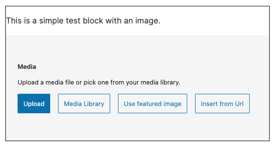
<p>{__('This is a simple test block with an image.', 't2')}</p>
<MediaSuiteViewer
mediaId={mediaId}
mediaUrl={mediaUrl}
mediaType={mediaType}
aspectRatio="5/2"
renderMediaPlaceholder={(viewerProps) => (
<MediaSuitePlaceholder
accept="image/*,video/*"
allowedTypes={['image', 'video']}
aspectRatio={viewerProps.aspectRatio}
onToggleFeatured={(value) => setAttributes({ useFeatured: value })}
onSelectMedia={updateMedia}
onSelectUrl={updateMedia}
/>
)}
/>
</div>
);
}Reference
MediaSuitePlaceholder component props
export type MediaSuitePlaceholderProps = {
    /**
     * A string passed to `FormFileUpload` that tells the browser which file types
     * can be uploaded to the upload window the browser use e.g: `image/*,video/*`.
     *
     * This property is similar to the `allowedTypes` property. The difference
     * is the format and the fact that this property affects the behavior of
     * `FormFileUpload` while `allowedTypes` affects the behavior `MediaUpload`.
     *
     * @see MediaPlaceholderProps.allowedTypes
     */
    accept?: MediaReplaceFlowProps['accept'];

    /**
     * Array with the types of the media to upload/select from the media library.
     * Each type is a string that can contain the general **mime type** e.g:
     * `image`, `audio`, `text`, or the complete mime type e.g: `audio/mpeg`,
     * `image/gif`. If `allowedTypes` is unset all mime types should be allowed.
     *
     * This property is similar to the accept property. The difference is the
     * format and the fact that this property affects the behavior of
     * `MediaUpload` while `accept` affects the behavior `FormFileUpload`.
     *
     * @see MediaPlaceholderProps.accept
     */
    allowedTypes?: MediaReplaceFlowProps['allowedTypes'];

    /**
     * If true, and if `multiple` is true the gallery media modal opens directly
     * in the media library where the user can add additional images.
     *
     * When uploading/selecting files on the placeholder, the placeholder
     * appends the files to the existing files list. If false the gallery media
     * modal opens in the edit mode where the user can edit existing images, by
     * reordering them, remove them, or change their attributes.
     */
    addToGallery?: MediaReplaceFlowProps['addToGallery'];

    /**
     * Whether to allow multiple selection of files or not. This property will
     * also accept a string with the value `add` to allow multiple selection of
     * files without the need to use the `Shift` or `Ctrl`/`Cmd` keys.
     */
    multiple?: MediaReplaceFlowProps['multiple'];

    /**
     *  Sets the aspect-ratio style on the placeholder.
     */
    aspectRatio?: CSSProperties['aspectRatio'];

    /**
     * Sets the width style on the placeholder.
     */
    heightStyle?: CSSProperties['height'];

    /**
     * Sets the width style on the placeholder.
     */
    widthStyle?: CSSProperties['width'];

    /**
     * Callback used when an upload error occurs.
     */
    onError?: MediaReplaceFlowProps['onError'];

    /**
     * Callback called before starting to upload the files. It receives an
     * array with the files to upload before to the final process.
     * It means that it's possible these files couldn't be uploaded.
     */
    onFilesPreUpload?: MediaReplaceFlowProps['onFilesUpload'];

    /**
     * Callback used when useFeatured changes.
     * Displays the Use Featured Media menu item in the dropdown,
     */
    onToggleFeatured?: (useFeatured: boolean) => void;

    /**
     * Callback used when media is replaced (required).
     */
    onSelectMedia: UpdateMediaHandler;

    /**
     * Callback used when media is replaced with a URL. Displays a corresponding menu item in the dropdown.
     */
    onSelectUrl?: BasicMediaHandler;

    /**
     * Callback used when media is embedded. Displays a corresponding menu item in the dropdown.
     */
    onEmbedUrl?: BasicMediaHandler;

    /**
     * An object or an array of objects that contain media ID (id property) to
     * be selected by default when opening the media library.
     */
    value?: { id: number } | { id: number }[];

    /**
     * When the value is set to `false` or returned as `false`, the handling of
     * the upload is left to the consumer component. The function signature
     * accepts an array containing the files to be uploaded.
     */
    handleUpload?: MediaReplaceFlowProps['handleUpload'];

    /**
     * If true, the MediaUpload component auto-opens the picker of the respective platform.
     */
    autoOpenMediaUpload?: boolean;

    /**
     * Class name added to the placeholder.
     */
    className?: string;

    /**
     * If true, the Drop Zone will not be rendered. Users won't be able to
     * drag & drop any media into the component or the block. The UI controls
     * to upload the media via file, url or the media library would be intact.
     */
    disableDropZone?: boolean;

    /**
     * If true, only the Drop Zone will be rendered. No UI controls to upload
     * the media will be shown. The `disableDropZone` prop still takes
     * precedence over `dropZoneUIOnly` – specifying both as true will result
     * in nothing to be rendered.
     */
    dropZoneUIOnly?: boolean;

    /**
     * If true, only the Drop Zone will be rendered. No UI controls to upload
     * the media will be shown
     */
    disableMediaButtons?: boolean;

    /**
     * Icon to display left of the title. When passed as a String, the icon will
     * be resolved as a Dashicon. Alternatively, you can pass in a Component
     * such as BlockIcon to render instead.
     */
    icon?: ReactNode;

    /**
     * If true, the property changes the look of the placeholder to be adequate
     * to scenarios where new files are added to an already existing set of
     * files, e.g., adding files to a gallery. If false the default placeholder
     * style is used.
     */
    isAppender?: boolean;

    /**
     * An object that can contain a `title` and `instructions` properties.
     * These properties are passed to the `Placeholder` component as `label`
     * and `instructions` respectively.
     */
    labels?: {
        title: PlaceholderProps['label'];
        instructions: PlaceholderProps['instructions'];
    };

    /**
     * Media preview to be rendered in the placeholder.
     */
    mediaPreview?: ReactNode;

    /**
     * A list if rendered notices.
     */
    notices?: PlaceholderProps['notices'];

    /**
     * Displays a Cancel button in the placeholder and is called when the
     * Cancel button is clicked.
     */
    onCancel?: (event?: MouseEvent) => void;

    /**
     * This event handler is applied to the internal Placeholder element.
     */
    onDoubleClick?: (event?: MouseEvent) => void;

    /**
     * Renders a custom Media Library Button.
     */
    mediaLibraryButton?: (arg: { open: () => void }) => Element;

    /**
     * Renders a custom Placeholder with the given content.
     */
    placeholder?: (content: ReactNode) => Element;

    /**
     * Placeholder styling.
     */
    style?: CSSStyleDeclaration;

    /**
     * Children are appended at the end of the Placeholder content.
     */
    children?: PlaceholderProps['children'];
};