MediaSuiteViewer
An extensible media viewer for images, videos, embedded (streaming) media, and custom media formats.
The MediaSuiteViewer component can act as a basic media viewer for images and videos, or be extended to support embedded media (e.g., YouTube, Vimeo) and custom formats (e.g., audio players). It can also serve as a host for placeholders, pickers, and captions.
Important: When creating a new block, consider using the integrated MediaSuite wrapper component instead of MediaSuiteViewer directly. MediaSuite provides built-in support for placeholders, pickers, captions, and embedded (streaming) media.
Basic usage
Simple example: mediaId only
In its simplest form, MediaSuiteViewer can display an image or video by providing a mediaId like this: <MediaSuiteViewer mediaId={mediaId} />.
import { MediaSuiteViewer } from '@t2/editor';
import { useBlockProps } from '@wordpress/block-editor';
import { __ } from '@wordpress/i18n';

export default function Edit({ attributes }) {
	const { mediaId } = attributes;
	const blockProps = useBlockProps({ className: 't2-test-block' });

	return (
		<div {...blockProps}>
			<p>{__('This is a simple test block with an image.', 't2')}</p>
			<MediaSuiteViewer mediaId={mediaId} />
		</div>
	);
} Simple example: mediaUrl only
The mediaId is not required. You can also provide a mediaUrl directly, for example: <MediaSuiteViewer mediaUrl="https://example.com/image.jpg" />.
import { MediaSuiteViewer } from '@t2/editor';
import { useBlockProps } from '@wordpress/block-editor';
import { __ } from '@wordpress/i18n';

export default function Edit({ attributes }) {
    const { mediaUrl } = attributes;
    const blockProps = useBlockProps({ className: 't2-test-block' });

    return (
        <div {...blockProps}>
            <p>{__('This is a simple test block with an image.', 't2')}</p>
            <MediaSuiteViewer mediaUrl={mediaUrl} />
        </div>
    );
}Fast media loading
For faster media loading, store the media id, url, and type in your block attributes and always pass them to the viewer: <MediaSuiteViewer mediaId={mediaId} mediaUrl={mediaUrl} mediaType={mediaType} />.
By providing both mediaUrl and mediaType along with mediaId, the media can be loaded instantly without waiting for the WordPress REST API to resolve its URL and type.
import { MediaSuiteViewer } from '@t2/editor';
import { useBlockProps } from '@wordpress/block-editor';
import { __ } from '@wordpress/i18n';

export default function Edit({ attributes }) {
	const { mediaId, mediaUrl, mediaType } = attributes;
	const blockProps = useBlockProps({ className: 't2-test-block' });

	return (
		<div {...blockProps}>
			<p>{__('This is a simple test block with an image.', 't2')}</p>
			<MediaSuiteViewer mediaId={mediaId} mediaUrl={mediaUrl} mediaType={mediaType} />
		</div>
	);
}Figure and picture wrappers
MediaSuiteViewer can optionally wrap media in a <figure> tag by setting the figureWrapper prop to true. You can also pass custom properties to the wrapper via the figureProps prop.
For images only, you can wrap the image in a <picture> tag by setting the pictureWrapper prop to true, and pass custom properties via the pictureProps prop. For non-image types (such as videos), these props will be ignored.
Note: By default, media is wrapped in a <figure> tag whenever a picker or caption is rendered via renderMediaPicker or renderMediaCaption. You can override this behavior by setting figureWrapper to false.
import { MediaSuiteViewer } from '@t2/editor';
import { useBlockProps } from '@wordpress/block-editor';
import { __ } from '@wordpress/i18n';

export default function Edit({ attributes }) {
	const { mediaId, mediaUrl, mediaType } = attributes;
	const blockProps = useBlockProps({ className: 't2-test-block' });

	return (
		<div {...blockProps}>
			<p>{__('This is a simple test block with an image.', 't2')}</p>
			<MediaSuiteViewer
				mediaId={mediaId}
				mediaUrl={mediaUrl}
				mediaType={mediaType}
				figureWrapper={true}
				pictureWrapper={true}
                figureProps={ { className: 'test-block-image-figure' }}
                pictureProps={ { className: 'test-block-image-picture' }}
			/>
		</div>
	);
}Image size renditions
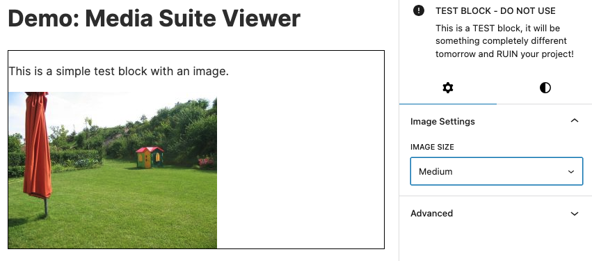
You can provide a mediaSize (e.g. thumbnail, medium, large) to load a specific rendition (size slug) from the WordPress media library. If no size is provided, the full-size image will load by default.
In this example, the user can select the image size with the ImageSizeSelector component in the inspector panel.
import { MediaSuiteViewer, ImageSizeSelector } from '@t2/editor';
import { InspectorControls, useBlockProps } from '@wordpress/block-editor';
import { PanelBody } from '@wordpress/components';
import { __ } from '@wordpress/i18n';

export default function Edit({ attributes, setAttributes }) {
    const { mediaId, mediaUrl, mediaType, mediaSize } = attributes;
    const blockProps = useBlockProps({ className: 't2-test-block' });

    return (
        <>
            <InspectorControls>
                <PanelBody title={__('Image Settings', 't2')} initialOpen={true}>
                    <ImageSizeSelector
                        value={mediaSize}
                        imageId={mediaId}
                        onChange={(slug, url) => setAttributes({ mediaSize: slug, mediaUrl: url })}
                    />
                </PanelBody>
            </InspectorControls>
            <div {...blockProps}>
                <p>{__('This is a simple test block with an image.', 't2')}</p>
                <MediaSuiteViewer mediaId={mediaId} mediaUrl={mediaUrl} mediaType={mediaType} mediaSize={mediaSize} />
            </div>
        </>
    );
}Media presentation (styling)
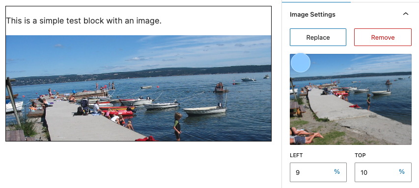
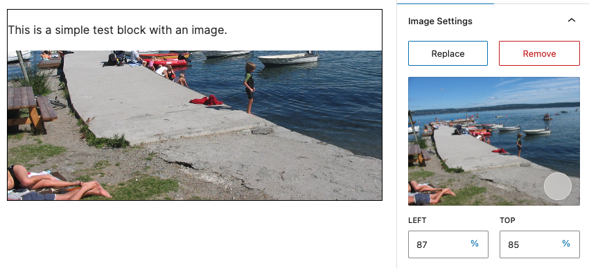
You can customize media presentation using the aspectRatio, focalPoint, and/or objectFit props. These generate corresponding CSS classes, styles, and variables on the media element, which should cover most use cases. If not, you can always override them with custom CSS.
If necessary, you can also use the widthStyle and heightStyle props to define custom dimensions, though they may conflict with the properties above.
As a fallback (not recommended), you can use the style prop to apply custom styles directly to the media element.
In this example, the user can pick media and set a focal point using the MediaAndFocalPicker component in the inspector panel.
import { MediaSuiteViewer, MediaAndFocalPicker } from '@t2/editor';
import { InspectorControls, useBlockProps } from '@wordpress/block-editor';
import { PanelBody } from '@wordpress/components';
import { __ } from '@wordpress/i18n';

export default function Edit({ attributes, setAttributes }) {
	const { mediaId, mediaUrl, mediaType, focalPoint } = attributes;
	const blockProps = useBlockProps({ className: 't2-test-block' });

	// Unified callback signature for both selecting and removing media.
	const updateMedia = (basic) => {
		setAttributes({ mediaId: basic.id, mediaUrl: basic.url, mediaType: basic.type });
	};

	return (
		<>
			<InspectorControls>
				<PanelBody title={__('Image Settings', 't2')} initialOpen={true}>
					<MediaAndFocalPicker
						mediaId={mediaId}
						mediaUrl={mediaUrl}
						mediaType={mediaType}
						focalPoint={focalPoint}
						onFocalChange={(value) => setAttributes({ focalPoint: value })}
						onSelectMedia={updateMedia}
						onRemoveMedia={updateMedia}
					/>
				</PanelBody>
			</InspectorControls>
			<div {...blockProps}>
				<p>{__('This is a simple test block with an image.', 't2')}</p>
				<MediaSuiteViewer
					mediaId={mediaId}
					mediaUrl={mediaUrl}
					mediaType={mediaType}
					aspectRatio="5/2"
                    focalPoint={focalPoint}
					objectFit="cover"
				/>
			</div>
		</>
	);
}Extending the media viewer
MediaSuiteViewer can be extended to include placeholders, pickers, captions, embedded media, and custom formats via five rendering callbacks:
renderMediaPlaceholder(corresponding T2 component: MediaSuitePlaceholder)renderMediaPicker(corresponding T2 component: MediaSuitePicker)renderMediaCaption(corresponding T2 component: MediaSuiteCaption)renderEmbeddedMedia(corresponding T2 component: MediaEmbedViewer)renderCustomMedia
You can use the corresponding T2 Media components or create your own custom components to render the media viewer extensions. The rendering functions receive the current MediaSuiteViewer props and should return a rendered element or undefined.
Before the rendering functions are called, the MediaSuiteViewer will check if the required conditions for each function are met. Only then will the function be called and its returned element displayed in the viewer.
For example, the renderMediaPlaceholder function will only be called when no media is defined (i.e. no mediaId or mediaUrl is provided). So usually, you don't have to check these conditions yourself.
Render a media placeholder
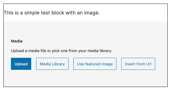
The renderMediaPlaceholder callback is used to render a media placeholder that allows the user to select a media. This function will only be called when no media is defined (i.e. no mediaId or mediaUrl is provided).
In this example, the MediaSuitePlaceholder is displayed in the media viewer when no media is defined. You can also use your own custom media placeholder.
import { MediaSuiteViewer, MediaSuitePlaceholder } from '@t2/editor';
import { useBlockProps } from '@wordpress/block-editor';
import { __ } from '@wordpress/i18n';

export default function Edit({ attributes, setAttributes }) {
	const { mediaId, mediaUrl, mediaType } = attributes;
	const blockProps = useBlockProps({ className: 't2-test-block' });

	// Unified callback signature for selecting media id and url.
	const updateMedia = (basic) => {
		setAttributes({ mediaId: basic.id, mediaUrl: basic.url, mediaType: basic.type });
	};

	return (
		<div {...blockProps}>
			<p>{__('This is a simple test block with an image.', 't2')}</p>
			<MediaSuiteViewer
				mediaId={mediaId}
				mediaUrl={mediaUrl}
				mediaType={mediaType}
				aspectRatio="5/2"
				renderMediaPlaceholder={(viewerProps) => (
					<MediaSuitePlaceholder
						accept="image/*,video/*"
						allowedTypes={['image', 'video']}
						aspectRatio={viewerProps.aspectRatio}
						onToggleFeatured={(value) => setAttributes({ useFeatured: value })}
						onSelectMedia={updateMedia}
						onSelectUrl={updateMedia}
					/>
				)}
			/>
		</div>
	);
}Render a media picker
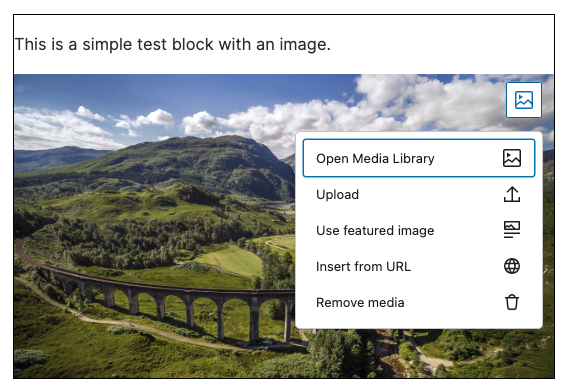
The renderMediaPicker callback renders a media picker that allows the user to change or remove the selected media directly inside the viewer. When this function is provided, the media will be wrapped in a <figure> tag by default.
In this example, the MediaSuitePicker is displayed in the upper right corner of the media viewer. You can also use your own custom media picker.
import { MediaSuiteViewer, MediaSuitePicker } from '@t2/editor';
import { useBlockProps } from '@wordpress/block-editor';
import { __ } from '@wordpress/i18n';

export default function Edit({ attributes, setAttributes }) {
	const { mediaId, mediaUrl, mediaType, useFeatured } = attributes;
	const blockProps = useBlockProps({ className: 't2-test-block' });

	// Unified callback signature for selecting media ids and urls.
	const updateMedia = (basic) => {
		setAttributes({ mediaId: basic.id, mediaUrl: basic.url, mediaType: basic.type });
	};

	return (
		<div {...blockProps}>
			<p>{__('This is a simple test block with an image.', 't2')}</p>
			<MediaSuiteViewer
				mediaId={mediaId}
				mediaUrl={mediaUrl}
				mediaType={mediaType}
				renderMediaPicker={(viewerProps) => (
					<MediaSuitePicker
						mediaId={viewerProps.mediaId}
						mediaUrl={viewerProps.mediaUrl}
						location="block"
						placement="top-end"
						accept="image/*,video/*"
						allowedTypes={['image', 'video']}
						useFeatured={useFeatured}
						onToggleFeatured={(value) => setAttributes({ useFeatured: value })}
						onSelectMedia={updateMedia}
						onSelectUrl={updateMedia}
						onResetMedia={updateMedia}
						replaceMediaText=""
					/>
				)}
			/>
		</div>
	);
}Render a media caption
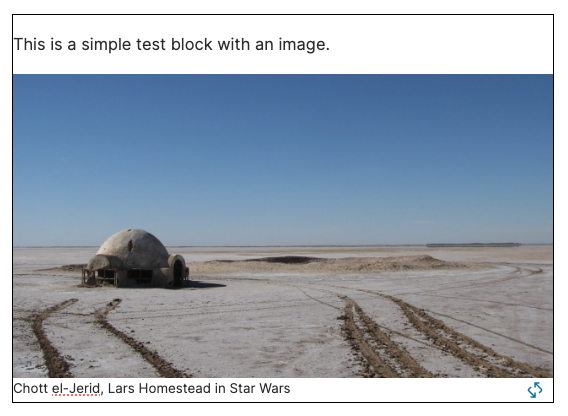
The renderMediaCaption callback displays a media caption and optionally lets the user edit it. When this function is provided, the media will be wrapped in a <figure> tag by default.
In this example, the MediaSuiteCaption is displayed below the media. You can also use your own custom media caption.
import { MediaSuiteViewer, MediaSuiteCaption } from '@t2/editor';
import { useBlockProps } from '@wordpress/block-editor';
import { __ } from '@wordpress/i18n';

export default function Edit({ attributes, setAttributes }) {
    const { mediaId, mediaUrl, mediaType, caption, showMediaCaption } = attributes;
    const blockProps = useBlockProps({ className: 't2-test-block' });

    return (
        <div {...blockProps}>
            <p>{__('This is a simple test block with an image.', 't2')}</p>
            <MediaSuiteViewer
                mediaId={mediaId}
                mediaUrl={mediaUrl}
                mediaType={mediaType}
                renderMediaCaption={(viewerProps) => (
                    <MediaSuiteCaption
                        mediaId={viewerProps.mediaId}
                        caption={caption}
                        showMediaCaption={showMediaCaption}
                        onCaptionChange={(value, show) => setAttributes({ caption: value, showMediaCaption: show })}
                    />
                )}
            />
        </div>
    );
}Render embedded (streaming) media
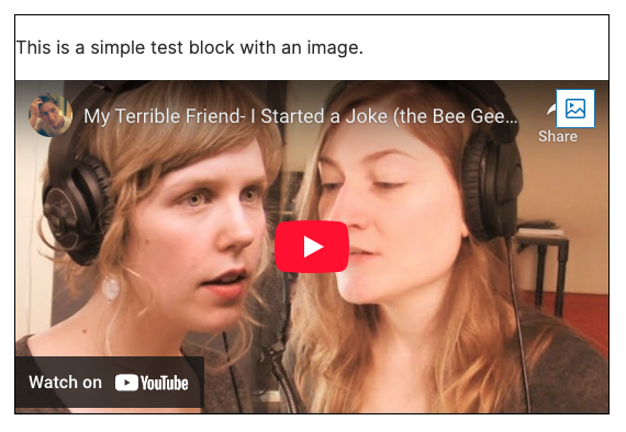
The renderEmbeddedMedia callback renders embedded (streaming) media from providers such as YouTube or Vimeo. This function is only called when mediaType is set to embed and a mediaUrl is provided.
In this example, the MediaSuitePicker is used to select and MediaEmbedViewer to render the embedded media. You can also use your own custom embedded media viewer.
Note: The MediaEmbedViewer is still unstable and is only tested with YouTube videos. More providers but also breaking changes will likely come in the future.
import {
	MediaSuiteViewer,
	MediaSuitePicker,
	__experimentalMediaEmbedViewer as MediaEmbedViewer,
} from '@t2/editor';
import { useBlockProps } from '@wordpress/block-editor';
import { __ } from '@wordpress/i18n';

export default function Edit({ attributes, setAttributes }) {
	const { mediaId, mediaUrl, mediaType, embedMeta } = attributes;
	const blockProps = useBlockProps({ className: 't2-test-block' });

	// Unified callback signature for updating media props.
	const updateMedia = (basic) => {
		setAttributes({ mediaId: basic.id, mediaUrl: basic.url, mediaType: basic.type });
	};

	return (
		<div {...blockProps}>
			<p>{__('This is a simple test block with an image.', 't2')}</p>
			<MediaSuiteViewer
				mediaId={mediaId}
				mediaUrl={mediaUrl}
				mediaType={mediaType}
				renderMediaPicker={(viewerProps) => (
					<MediaSuitePicker
						mediaId={viewerProps.mediaId}
						mediaUrl={viewerProps.mediaUrl}
						location="block"
						placement="top-end"
						accept="image/*,video/*"
						allowedTypes={['image', 'video']}
						onSelectMedia={updateMedia}
						onSelectUrl={updateMedia}
						onEmbedUrl={updateMedia}
						onResetMedia={updateMedia}
						replaceMediaText=""
					/>
				)}
				renderEmbeddedMedia={(viewerProps) => (
					<MediaEmbedViewer
						embedUrl={viewerProps.mediaUrl}
						embedMeta={embedMeta}
						onEmbedChange={(meta) => setAttributes({ embedMeta: meta })}
						aspectRatio={viewerProps.aspectRatio}
						focalPoint={viewerProps.focalPoint}
						objectFit={viewerProps.objectFit}
					/>
				)}
			/>
		</div>
	);
}Render custom media formats
The renderCustomMedia callback can render custom formats not supported by default, such as audio. This function will only be called when a mediaUrl with an unsupported mediaType (not image, video or embed) is provided.
MediaSuiteViewer properties (props)
export type MediaSuiteViewerElement = HTMLElement | HTMLImageElement | HTMLPictureElement | HTMLVideoElement;
export type MediaSuiteViewerProps = Omit<HTMLProps<MediaSuiteViewerElement>, 'src' | 'children'> & {
    /** Media (attachment) ID. Optional if mediaUrl is provided. */
    mediaId: number | undefined;

    /** Media URL. Recommended for performance; optional if mediaId is provided. */
    mediaUrl: string | undefined;

    /** Media type (e.g., image, video). Improves performance but is optional. */
    mediaType: string | undefined;

    /** Media size slug (e.g., `thumbnail`, `medium`, `large`). */
    mediaSize?: string;

    /** Sets the aspect-ratio style of the media element. */
    aspectRatio?: CSSProperties['aspectRatio'];

    /** Sets the focal point of the media element. */
    focalPoint?: FocalPoint;

    /** Sets the object-fit style on the media element. */
    objectFit?: CSSProperties['objectFit'];

    /** Height style applied to the media element (not the HTML attribute). */
    heightStyle?: CSSProperties['height'];

    /** Width style applied to the media element (not the HTML attribute). */
    widthStyle?: CSSProperties['width'];

    /** Whether to wrap the media in a <figure> tag. */
    figureWrapper?: boolean;

    /** Custom props for the <figure> wrapper (applies when figureWrapper is true). */
    figureProps?: HTMLProps<HTMLElement>;

    /** Whether to wrap images in a <picture> tag. */
    pictureWrapper?: boolean;

    /** Custom props for the <picture> wrapper (applies when pictureWrapper is true). */
    pictureProps?: HTMLProps<HTMLPictureElement>;

    /** Callback to render a media placeholder when no media is defined. */
    renderMediaPlaceholder?: (props: MediaSuiteViewerProps, media?: unknown) => Element | undefined;

    /** Callback to render a media picker. */
    renderMediaPicker?: (props: MediaSuiteViewerProps, media?: unknown) => Element | undefined;

    /** Callback to render a caption below the media. */
    renderMediaCaption?: (props: MediaSuiteViewerProps, media?: unknown) => Element | undefined;

    /** Callback to render embedded media. */
    renderEmbeddedMedia?: (props: MediaSuiteViewerProps) => Element | undefined;

    /** Callback to render custom media formats. */
    renderCustomMedia?: (props: MediaSuiteViewerProps, media: unknown) => Element | undefined;
};